Less than two weeks after the big Notability 14 update, we’re getting a lot of bug fixes. That can’t be good.
New user interface
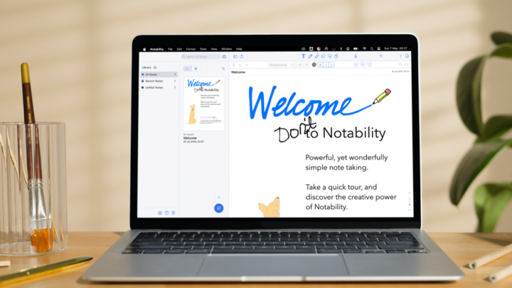
From the homepage to the workspace, Notability 14 looks more modern and minimalist. We never thought the app could get more minimalist than it already was. Apparently, it can. We love where they’ve put the settings icon and the search bar. It’s intuitive, as is the new way we’re creating folders now. The tabs for our recent and favourite notes also make sense. Then it goes downhill after that.
Homepage
We hate that they have put the gallery on the sidebar with our folders and notes in the app. We’ve never been fans of the gallery since its launch, so we would prefer it was tucked away somewhere we never saw it. I see myself accidentally tapping on the gallery and getting frustrated every single time. A social media platform in a productivity app is counterproductive, especially when the developers make it so readily available with the rest of our notes.
Just out of curiosity, besides potentially wasting scores of productivity hours scrolling through the Notability gallery, how many of us have actually found it useful enough to need it in the app?
Dividers are now more difficult to see since this update, thanks to the massive dots for our subjects in the app. To be fair, dividers have always been hard to see in Notability, but the new user interface just made it worse. Now we are forced to rely on colourful subjects (which I don’t use).
While we appreciate the minimalist look, it’s pointless if it doesn’t improve our user experience in the app. Yet, that is the main theme for almost every feature in Notability 14. It looks better while ruining our experience in the app. We now have to take too many steps to access and use pretty much every feature in the app. The recycle bin, for example, is no longer available on the homepage. Yet, there is plenty of room for the bin icon next to the settings icon. This extremely minimalist user interface can’t accommodate the recycle bin icon. Really?
Selecting multiple documents is also more tedious. Basically, in Notability 14, you will waste a lot of time doing things you have become used to doing in much fewer steps. That was Notability’s defining characteristic—its simplicity—and they just took that away.
Creating new notebooks
Creating new notebooks is now very confusing because of the page template options that appear at the bottom of the screen. Let’s try to appreciate the developer’s logic for this feature: a quick way for us to change our page templates after creating a notebook. Except it’s not working now, is it? The feature fails to override our custom default templates and just adds the templates above them. It looks terrible! At least we can undo, to clear the mess.
We tried to stay positive and import a document instead. So, importing a PDF into a new notebook is easy enough. We were happy about that until Notability failed to import the document correctly. This is a new level of dysfunction for such a big app! Notability failed to import the cover page of the digital notebook I just imported. It also ruined all the topic pages in it. That is indeed worrying. So, we should expect another bug-fixing update soon.
In disbelief, we tried something different. We were probably missing something. I mean, it’s Notability; we were determined to find out how these template options work. So, after changing our default page template for quick notes to a basic, plain one, we tried again. There you go! The options started making sense for a split second. But only if you have set the right line spacing for them. This just complicates our quick notes, which we’ve always been able to create with single taps. How is the new feature better than quick notes?
New workspace
A lot of apps have the option for full-screen mode. It’s usually an option we can choose never to use, which some of us never do. But Notability 14 has gone full-screen permanently. It also gives you the illusion that you’re taking notes on an infinite canvas, and it feels empty, like something is missing. That is because something is missing. Before, we could quickly rename our notebooks, without thinking too much about it. Now, in Notability 14, we have to scroll up to find our notebook name. You can also zoom out on the page to remove the infinite canvas illusion and then find your notebook title. Notability 14 now requires a lot of energy for us to do everything. But they made the gallery so easily accessible!
New toolbar
What do you think about the new icons? They look funny, no? Like someone squeezed them to look short and wide. The toolbar too, which is floating now in Notability 14. The developers took that one from Apple Notes. What a thing to copy. In Apple Notes, we’ve never known anything else. And after our complaints to Apple fell on deaf ears, we stopped complaining about it. You can imagine the horror when we saw this mini floating toolbar in Notability 14. Moving the toolbar to the different sides of the screen is even smoother in Apple Notes.
Now, we have to scroll to use some features: audio recording, tape, laser pointer and the ruler tool. How did the Notability developers think that this would give us a better user experience? Where before we could tap once to start or stop recording… now we have to scroll to the recording icon and then tap on it to start recording. Our audio playback speed is also buried under several layers.
If Notability had added more steps to a single feature, we would probably get over it. But they have complicated too many features in a single update. Each writing tool now has a colour palette that you can customise. We love this because the fixed colour options from before were a bit limiting for custom colours before we had a favourites toolbar. However, the new colour palette only houses a maximum of eight colours. After that, you have to scroll to get to the three pen thicknesses. For which you can only have a maximum of three. They took that one from GoodNotes. They just seem to be copying all the bad ideas.
Finally, on this toolbar, you can pick a pen type. Do the Notability developers genuinely believe that this new setup is better than the favourites toolbar we had before? Yeah, that’s gone; we no longer have a favourites toolbar in Notability. At least they separated the thicknesses for each tool. So, your pencil tool can have a different colour palette and pen thicknesses from what the pen tool has. We’re going to miss the favourites toolbar.
Why couldn’t Notability copy the user interface ideas in Noteful? Where removing the status bar makes the app look more minimalist for those who want that. The rest of us who don’t won’t be forced to use it. The toolbar in Noteful is mobile, so you can move it to any side of the screen. But, it’s not floating. So, it remains anchored to the edge of your screen, away from your page. It is long enough to house all the tools you need, so working in the app is very simple. Noteful even lets you save your favourite pen tools on the toolbar. And it also gives you the option to turn off features you don’t use for a minimalist feel. Why couldn’t the Notability developers implement this kind of minimalism? It works, right? Or is it just us?
New keyboard toolbar
The new keyboard toolbar is the first feature we loved in Notability 14. It looks good and has some presets for adding different types of headings and text formatting options. It’s brilliant and intuitive. Our favourite text styles are not that intuitive, though. We can no longer edit them, which is just annoying. Custom fonts are acting funny in the app. We can’t see them when we scroll through the fonts. But one of them keeps appearing, and we don’t know how. Notability 14 really took a lot from us.
Adding photos
They’ve removed the plus icon for adding different items to our notes and have given us a photo icon instead. It groups our stickers, GIFs, and sticky notes. Where is the logic in that? Does it feel weird that these pop up on the right side and not under the icons? Maybe that’s because I am right-handed.
Placed correctly, this popup window is better than the old one. That’s how we felt before realising that we no longer have the page options we used to have for our sticky notes. Now we’re stuck with just the page colours, which I never liked.
Multitasking
They have improved the note switcher to give us access to all our folders without exiting our notes. That is a thoughtful feature, even though the search tool is not readily available. It is accessible; there are just more steps than before. The small toolbar (which we hate so much) looks better when multitasking. It’s the only time you’ll be able to appreciate just how good it looks. Notability 14 looks good when multitasking. It’s less cluttered, which is awesome.
Page editing
Multiple-page selection has also improved. We now have a bigger window to select pages from. The thumbnails are too big, though. Smaller ones would fit more pages on the screen, which is better for faster navigation. Or even better, they could give us the option to zoom the thumbnails in and out like we can in Noteful. This feature we’re happy about at least. But, they shouldn’t have tucked away the icons for bookmarks and notes. Why is there a ‘but’ with every feature in this update?!
The zoom window is no longer available in the bottom corner. Like most features, you need to dig through several options to get to it. It looks terrible! Some demarcations to mark different tools could improve how the app looks. A thin line around the zoom window is honestly not bad. They didn’t have to remove it.
Search tool
Search is terrible; both from the workspace and homepage. In the workspace, Notability no longer tells you how many terms it found. It’s not a major change, but because of everything else going on in Notability, it feels like too much has changed. At this point, we are in panic mode, the lack of title and content results on the homepage is probably the straw that has broken this camel’s back.
Our wish list
From our Notability wish list, we got an accessible redo icon. We’re still stuck with the same dysfunctional page rotation that doesn’t rotate our ink. Our sincerest sympathies go out to all the Notability users. We feel your pain and wish there was something we could do to help. This is the second update from Notability that just shows how little the developers care for their users.
Verdict
The lack of demarcations in Notability 14 is giving me a headache, which makes the app very unpleasant to use. The developers should seriously consider going back to the old design because this is simply not working. Notability 14 is not user-centric, and we absolutely hate it.
